
Tadpoles Parents APP
Childcare Communication Mobile App Redesign

Problem Statement
The objective is to enhance the user experience of the Tadpoles Parents communication app.
USERS
Parents of children in daycare
MY ROLES
Research
Ideate
Designing Features
Wireframes
Testing
YEAR
2022
The Tadpoles Parents communication app serves as a vital tool for facilitating communication between childcare providers/daycares and parents. However, several issues have been identified regarding the design and functionality of the original app.
The initial version of the app solely enabled communication from childcare providers to parents, lacking a crucial feature for parents to respond or engage in real-time conversations with the staff. The user interface (UI) also requires improvements, as the buttons are unresponsive and users are left uncertain about their functionality or whether certain actions have been successfully executed. It is important to note that this analysis focuses exclusively on the parents' app, while recognizing the existence of a companion app utilized by the daycare/childcare provider.
My familiarity with this app stems from my child's current attendance at the daycare, which introduced me to the platform. In order to address these concerns, a Design Thinking approach will be employed to delve into a comprehensive exploration and reimagination of the parents' app.
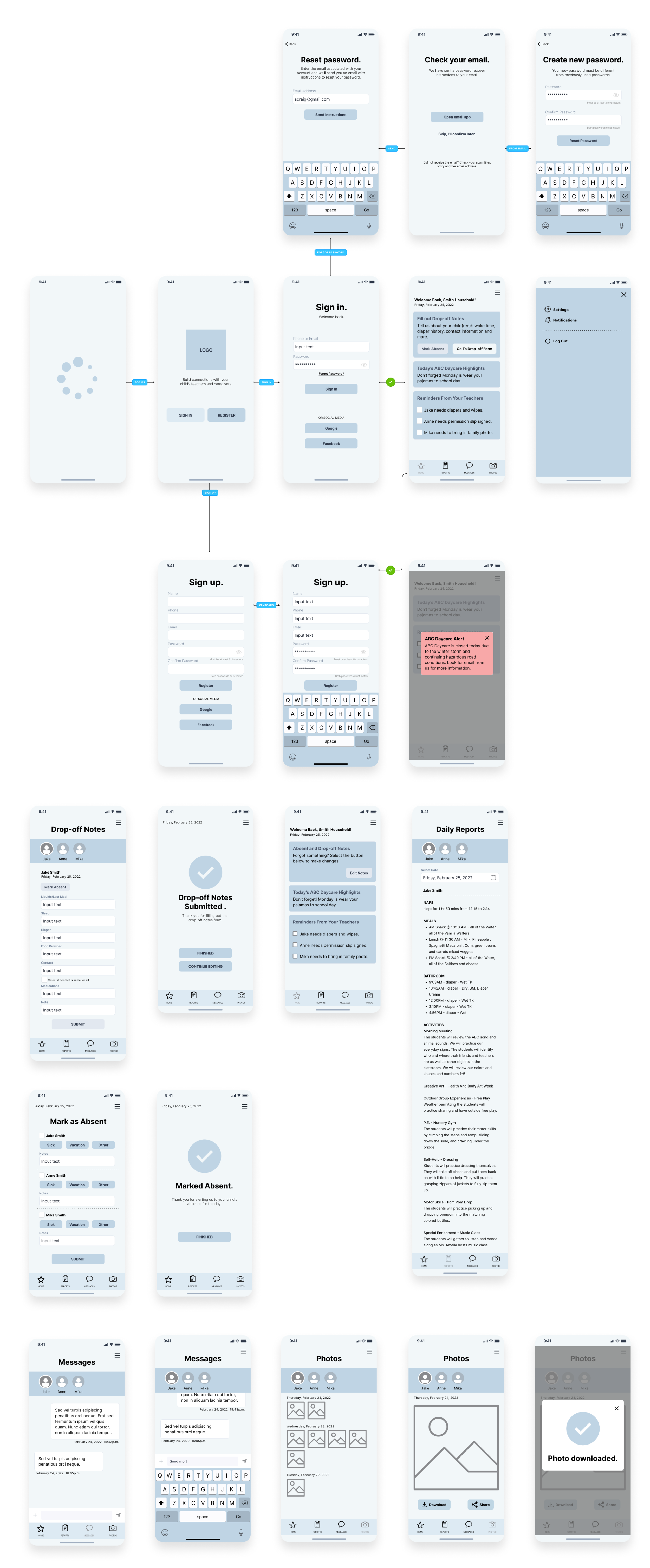
ORIGINAL TADPOLES PARENTS APP DESIGN

MY Design thinking PROCESS
Empathizing
Understanding the human needs involved. By first understanding the users reactions to the original design, I was able to empathize with them the issues they had with the app. I gained this understanding through user research.
Defining
Re-framing and defining the problem in human-centric ways. I reframed the problems through a current case journey-map and pulling design scope ideas from the user research quotes.
Ideating
Creating many ideas in ideation sessions. I first created a happy path storyboard that framed the idea of an app that was a delight to use. A total 180 from the current case. From that I designed wireframes with multiple rounds of iterations to come up with solutions that would not only delight the user, but relieve the issues they had with the original design.
Prototyping
Adopting a hands-on approach in prototyping. With the wireframes, I created a clickable version of the app that users could test from anywhere.
Testing
Developing a testable prototype/solution to the problem. With the wireframe prototype I was able to gain valuable feedback regarding the design and interactions.
Remote User Research
There are currently over 100k downloads and only 2 out of 5 stars in the Google play store. With a little more than a thousand reviews on the app, I was able to review nearly 40 of the most recent reviews and parse out some qualitative feedback. The reviews revealed some consistent feedback including issues with UI, limited functionality surrounding communication, and frustrations with uneditable notes after submission.
SAMPLE QUOTES FROM APP USERS
“…unable to download photos, add drop off notes, update the contact, or enter the pick up time.” - John E.
”We need the ability to change a day's contact. We need to be able to update notes after dropoff.” - Alex K.
”However, the giant "mark as absent" button on the drop-off notes is just asking to be clicked when finished. Why not have a "Done" button as well. The X in the top corner make less sense than a button.” - Stephanie G.
Journey Map
Based on my own experience and speaking with other parents, I created a current-state journey map to show the current experience with the Tadpoles app.

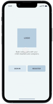
Feature Design
Based on the feedback reviews from google play, my own experiences, and speaking with other parents at our daycare, these features would be considerable improvements on the current product.
1. Photo sharing with a download feature
2. Two-way real-time communication
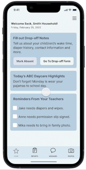
3. Daily reports from caregivers
4. Drop-off notes from parents
5. Responsive buttons from download
6. Toggle between multiple children
Happy Path Storyboard
Using this storyboard as a tool for ideation, I explored some of the activities a parent might do during a normal day with the app and daycare.

Basic Wireframes
I created basic wireframes for each screen view. There were several variations on how the user could view each child’s information. I explored different swiping options when viewing and submitting information, but decided in the end that a simple filter/tab option was the best route as the screen length can vary. Swiping and scrolling would most likely seem clunky to the user. But a filter/tab option is a familiar interaction.
TESTING WIREFRAME PROTOTYPE
I created a clickable prototype from the wireframes using Figma. I sent the working link to a few parents I knew from my local community.
OUTCOME/LESSONS LEARNED
There was much to be learned from this developed concept. Users are excited for an app that is a functional communication tool between daycare teachers/staff and parents. This project could use more rounds of testing and iteration, but the overall feedback was positive. We could ask questions for future iterations. Do parents want more resources included in this app? Ideas for things to do at home with their child? Do they want a feature to schedule a one-on-one with teachers or staff? Would they want a way to pay the daycare and manage the administrative tasks from having a child in daycare? Would that be a reasonable thing to ask of an app that is essentially a communication tool?
All of these questions are valid and with enough time, research, ideating, and testing could create an app that truly delights the user.