TOYOTA SPARK APP
UI APP DESIGN
-
Goal: help Toyota Parts and Service sales representatives redeem rewards, track sales status, and access program details
My Role: workflow design, wire-framing, prototypes
Pain Points: lack of mobile version for easy access; user journey in need of improvement
Proposed Solutions: develop a mobile version of the app; ideate content, site structure, and logo branding; incorporate micro-interactions, graph animations, and parallax scrolling in the desktop version; design the website and app to be dynamic, allowing users to update reports and account information from the connected database
Project Outcome: easy access to program details through the mobile app; improved user journey and intuitive use; dynamic website and app with the ability to update reports and account information
The Challenge
The new redesigned Toyota Spark app is designed to give Toyota Parts and Service sales representatives a way to redeem rewards, track their status for sales, and access program detail information. The original project was created in 2018 to incentivize parts and services sales reps to meet goals set by Toyota sales leaders. I revisited this project in 2021 to reimagine the user experience.
Insights:
These insights were collected by evaluating the current design, comparing it to other similar types of applications, and thinking of best practices for user experience. There wasn’t any typical initial user research done for this project, although the idea was tested once the latest version was completed.
#1: MOBILE VERSION
Users should be able to access the information from the website with a mobile version downloadable app.
#2: RETHINK JOURNEY
Current site architecture isn’t easy to navigate. Examine user journey and rethink the way a user would access information.
#3: INTUITIVE USE
Think about user interactions with the app. The app needs to give feedback when prompted and be intuitive to use.
Ideation:
Content/Site Structure:
Part of the design process included ideation of the included content as well as the layout.
Once I had a firm grasp on what information needed to be included, I could think about how to fit those pieces into to new dashboard idea.


Logo Branding:
I needed to rethink the logo used on the site as well. As this site/app isn’t customer-facing, and as the app/site is for a specific sales audience, the use of “SPARK” (the app namesake) could be more prominent.


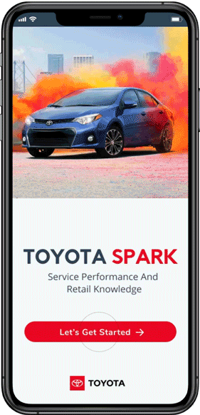
TOYOTA SPARK MOBILE APP
The mobile version of the app allows the user easy access to program details. When redesigning this app, I kept the mobile version in mind first. Generally, most app users would be accessing this information via tablet or phone device before using it on the desktop.
The user can log-in, create an account, view dashboards, view Sales and Service leaderboards, their Reports, eLearning tools, account information, and the ability to access the shopping application to redeem rewards. The user has access to any information that would be available on the desktop version from the mobile app.
This design includes micro-interactions, animated graphs, and parallax scrolling for a modern visual appeal. The feedback from the micro-interactions gives the user information that what they’ve clicked on is being loaded.

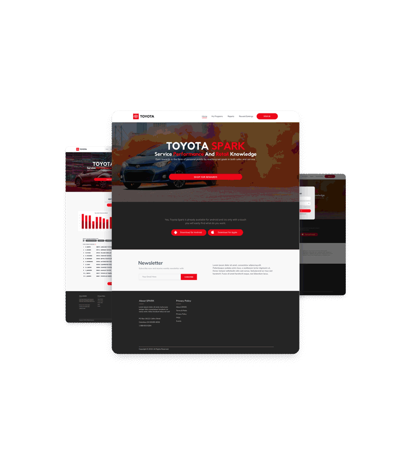
TOYOTA SPARK DESKTOP VERSION
This desktop website is designed to mimic the aesthetics of the mobile version of the app. It uses similar micro-interactions, graph animations, and parallax scrolling.
The website and mobile app are meant to be dynamic. With the click of the “Update” button, the user will be able to update reports, account information, and stats from the connected database. This feature would solve the problem of having to wait for information to be manually entered to see the most up-to-date stats.